Medeu Park Hotel
A hotel designed to inspire
Customer
Task
Result
Services
Deadlines
For Medeu Park Hotel, we created a visual system based on respect for the context and specific character of the place. The new brand combines the aesthetics of modernism, natural lightness and architectural expression forming an integral image of a modern mountain hotel.

Three Medeu wooden huts of Pusurmanov, c. 1870.

Medeo Hotel, late 1970s and until 2010.

Medeu Park Hotel, 2025.
The story of Medeu starts with the hotel
Medeu Park Hotel's visual style is made of respect for a place that itself has become a legend.
Our goal is not just to create identity for a new hotel but to carefully restore the spirit of the space that inspired generations.
Soviet modernism of the 30s is at the heart of aesthetics: strict geometry, clarity of shapes and poetic simplicity. Through each line and shade, we sought to evoke subtle, almost visceral sensations that remained after encountering something truly beautiful.


Brand Strategy and Platform
After performing market intelligence and highlighting the key advantages of the hotel, we have established the Medeu Park Hotel brand platform: we determined its values, purpose, mission and positioning.
The main idea of the brand is to give exclusive and unique feelings after you spend your time at the Medeu Park Hotel while revealing the aesthetic aspects of each visitor's personality.


Based on the chosen positioning, we have determined that the greatest effect in promotion will be brought by working with a specific target audience, i.e. with innovators: Business Trippers, Local Aspirers and Travel Aesthetes.
We analyzed their demands and expectations: those were people looking for new and unique aesthetic experiences. Experienced travelers who have seen hotels of different categories, take the high level of service for granted.
In that case we are not talking about standards but rather about the depth of the feelings, about the harmony between the style of old Almaty and modern design and service elements that create a special atmosphere.
Our task is to show how relevance and authenticity intertwine generating the unique experience of living and personality of the hotel.
Based on the nature of the brand and its positioning: "created to inspire," we have formed a tone of voice and a communication strategy.

Based on a unique location, we have set an ambitious but achievable PR goal: to make the Medeu Park Hotel a new architectural and tourist symbol of the region and to ensure that the hotel becomes synonymous with the Medeu mountain area.


Logo symbol
We sought to express in the graphics the feeling of freedom and clear air of the Zailiyskiy Alatau, to convey the lightness and desire for the peaks, both symbolic and literal peaks. The image of the swallow became the natural embodiment of that idea: a bird associated with flight, victory and local culture.
Also, the visual style refers to the aesthetics of the Soviet modernism of the 30s: strict, geometric, but deeply poetic. Through each shape, line and shade, we sought to evoke the very subtle, almost intuitive feelings that remain with a person after meeting something truly beautiful.
Logo
The symbol was inspired by the swallow representing lightness, movement and achievement. This is a reference both to the natural freedom that everyone feels in Medeu and to the famous installation of five swallows on the dam that can be seen from the ice rink.
- The symbol also resembles architectural forms: sharp lines, upward movement and slight asymmetry.
- The combination symbol includes a graphic element and the lettering: Medeu Park Hotel.
- It is adaptive, it is easily scalable, it works both in color and in monochrome, it has a sophisticated protection area and strict rules of use.


Printed content
For the typographic system, we have chosen two fonts that combine:
- historical basis (architectural modernism),
- modern aesthetics (geometry, legibility and simplicity).
Twelkmeyer
An expanded and specific font recreated by Anna Seslavinskaya to the sketches of the architect Viktor Tvelkmeyer (VKHUTEIN). He personifies the architecture, avant-garde and aesthetics of the Soviet constructivism.

Viktor Tvelkmeyer

Futura PT
Stripped grotesque representing progressiveness, processability and clear shapes. The Cyrillic version of Futura Medium was created for the Olympics-80 and represents the historical and cultural depth.
The combination of these fonts emphasizes the architectural nature of the location, connects the present with the past and also creates a specific rhythm in communication.

Paul Renner


The color palette of the Medeu Park Hotel is formed at the junction of three sources of inspiration: the nature of the Zailiyskiy Alatau with its forests, stone, sky and sunsets; hotel interior design with its warm wood and fabric textures; and also a cultural context in which heavy and noble shades play an important role.


Graphic elements and patterns
The keynot is the intersection of swallows
A multi-layered and scalable element that refers to architecture and the idea of upward moving. It can be used as a decorative appeal, image mask or background.
Font pattern
Oblique company-branded font at a 22-degree angle creats a sense of structure and rhythm. It is used in the design of media, packaging and environment.


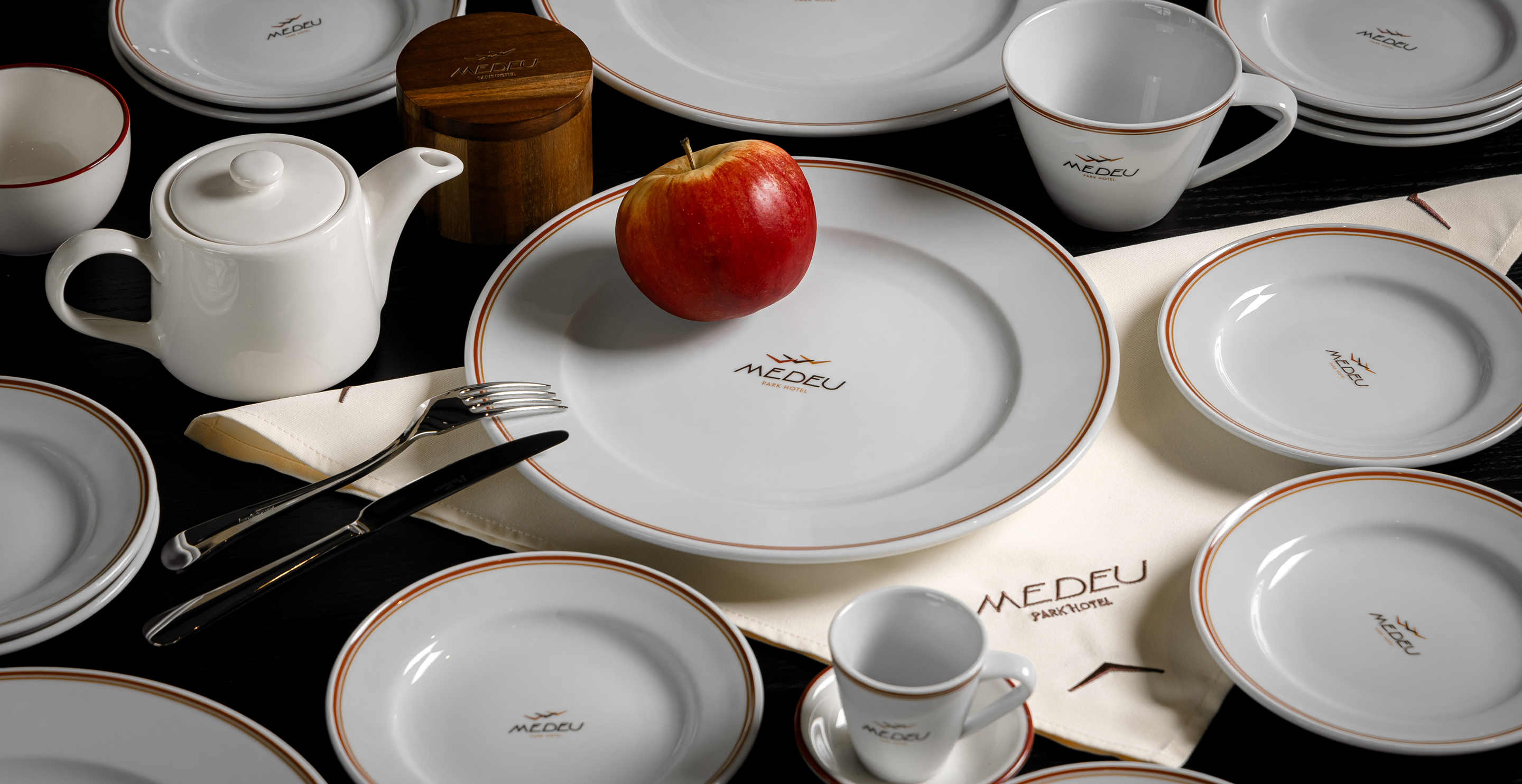
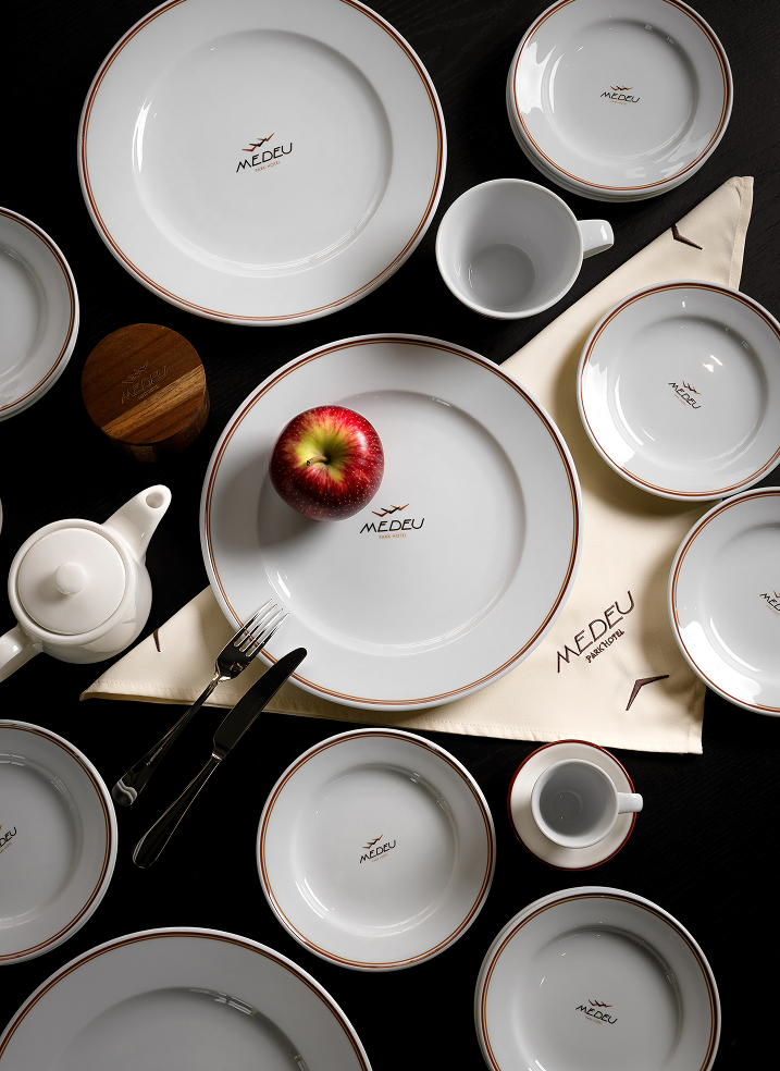
More than 50 types of media have been developed, from basic (business cards and letterheads) to unique ones:
- Branded outfit and vanity kits
- Patterned and varnished packaging
- Souvenirs and merch (shopper bags, slippers and notebooks)
- Items for rooms, a restaurant and SPA
- Elements for digital and social networks
Each item supports a key idea: create emotions, maintain aesthetics and be recognizable.

The marketing strategy includes Instagram recommendations, a number of recommendations for advertising campaigns, pictures for social networks and a website. We identified a visual aesthetic that blends the natural environment of Medeu with the comfort and modernity of the hotel: soft light, soft textures, clean lines and a sense of calm relaxation.
We also prepared patterns for posts for different types of publications which allowed the hotel team to build visually complete communication, regardless of the content form.


The created identity looked seamless with the atmosphere of the Medeu Park Hotel, a place where modern comfort is combined with the peace of nature. The developed communication strategy conveys the hotel personality: sophisticated, warm and attentive to details.
Medeu Park Hotel has become a new chapter in the history of the mountain area as of the space where the past and present meet in harmony.
We kept the spirit of that place and gave it a new sound: modern, aesthetic and inspiring. Medeu Park Hotel is a hotel designed to inspire.
we create projects
that make
people's lives better
credits
Manager
Svetlana Polikarpova
Art Director
Daria Bekenova
Designers
Dzhumagalieva Asel
Taisiya Leshina
Manager
Svetlana Polikarpova
Art Director
Daria Bekenova
Designers
Dzhumagalieva Asel
Taisiya Leshina